Pages

Showing posts with label Design. Show all posts

Saturday, November 19, 2022

Greeting cards from my sculpture feels like I'm printing my own currency.

Not many folks have wall space for eight foot long carvings, but they do appreciate my art. Printing these cards using details of the carvings feels like a win/win situation: people have something and the art can begin to find its audience.

Seeing on hundred cards all lined up is so satisfying. It feels like printing my own currency.


Thursday, October 16, 2014

Sculpture and the Uncomfortable - Katerina Kamprani

Like a dream of Franz Kafka, utilitarian objects loose their function and acquire different meanings
in a series called  The Uncomfortable by architect Katerina Kamprani.

She's brilliantly................peverse.


Ms. Kamprani says of herself: "I am an architect and I do the work of a rational engineer by day.  I have experience in the designand construction of buildings,  interiors and exhibition booths.
 I am currently employed at ncmp architects.

By night, I am a design enthusiast, interested both in graphic and product design.
As a graphic designer, I have enjoyed freelancing on various projects from branding, to illustrations and print design. In my free time, I re-design everyday objects for my personal project  
 I love image making in any way shape or form, but my favorite tools are 3dsMax and Vray.

Panic attack stairs?


Monday, August 11, 2014

Cutting a Rug- Drawing in Concrete

After this project is done, I'm working on short quick sculptures for a while! But why wait?

A friend helped me cut the outline of a rug, complete with fringe into the concrete in front of the studio.
From idea to reality in 45 minutes. A nice quick procrastination and back to carving.

 The result makes me laugh, it's about as conceptual as my art can be. What will the field pattern be?

Friday, June 20, 2014

Sculpture and the Association of Northwest Landscape Designer's 2014 Garden Tour


Time for the Association of Northwest Landscape Designer's 2014 Garden Tour, Saturday June 28.
Six gardens are on the tour, each featuring art and sculpture. My art will be in the Moore Garden.


That arbor needs to do more than just support a clematis. Since the neighbors are so close, let's use it to frame a sculpture and create a view within this garden......


There is a deluxe garden shed that serves as a winter conservatory for tender plants.
The little lion now stands guard outside that door.


It's an effort to transport these heavy cast stone sculptures. I got smart and hired strong help to carry and install the sculpture. It's all worth it to see how art changes the way you experience a garden space.


Adam leveling the steel frame for St Francis.
 

Wednesday, March 5, 2014

Sculpture and the little tree

Good ideas are a dime a dozen.
Making one idea into reality can take years.

Here's my first iteration of the little tree. 1980? The idea is clear but it was put aside......


30+ years later, here is the revised little tree, below.
The idea has grown, circles within circles, day and night transitioning.
  Is it possible to cut in paper a gestalt of a humble landscape that feels transcendent?

There's aesthetic learning and there is the technical learning curve. 
The ability to cut complex designs into metal means the design needs to be modified 
for mechanical laser cutting. Those sharp acute angle cuts are expensive 
because the laser has to back out of each cut instead of curving around and continuing.
Also pointy paper can't hurt you, but sharp metal projections can.....

That crisp look that comes naturally to a hand with a razor blade needs a softer radii
 for production. The question: does that happen when I make the next papercut - 
cutting softer corners or does it happen digitally, in the vector drawing stage?
And how much will that change the look of the image?
All to be discovered with the next iteration.


Below is a cardboard model for a gate with a fabulous faux iron patina.
It fooled my metal fabricator!

Here's how the metal panel looks in good light.
The art is an object, with sun light it becomes an environment.


And below what they looked like in the finished Yard Garden and Patio garden.
The no-contrast black on black was a big disappointment. That lasted the 3 days of the show. 
The show over, I realized that YGP was the incentive to make them, 
now to search for their ideal setting.


Wednesday, February 26, 2014

Sculpture and the 2014 Home and Garden Show #2

Linda Meyer designed this booth for JP Stone Contractors.
She chose blue foliage plants of different shapes and textures to compliment my large relief panels.


It's only a 10 x 10 foot booth but it shows how good design makes a small space calm and inviting.
The pink flowers of the heather adds a quiet pop of color.


It's funny how our minds compartmentalize information. I love the look of this booth, all the while ignoring the necessary but ugly brilliant yellow caution tape marking the change in grade from floor to paving and the chaos of the next aisle of vendors.


Monday, February 24, 2014

Sculpture and the 2014 Home and Garden Show

You can plan all you want, but you never know exactly how a display garden will look until it's done.
Pam Kill of GreenGold Studio, designed the booth for the Association of Northwest Landscape Designer's. The judges gave our booth a gold medal!


Here's the column, an architectural fragment, newly functional as a pedestal.


The fountain is more architectural fragments, sewer pipe and an old concrete basin.
The acid washed concrete is a nice ochre that picks up the colors from the stone of the retaining wall.


The circular arbor, created by Dana Dokken of Bridge City Arbors, anchors the booth.
The surprise factor is the jewel colored sheer drapes. 
In Dana's car the material looked gaudy. 
But in the dark, cavernous space of the Expo Center, the fabric glows and invites you into the space. 
The lesson is that display garden is Theater and needs a WOW factor.


Next the other sculptures I have in this show!

Tuesday, February 18, 2014

Sculpture and Color

Think about Lucy's lips. They're not really that shape, especially the upper lip.
Most sculptors never think about the fact that color can overpower form.
Once you accept this humbling fact, you can turn it to your advantage and use color to redefine space.
 ----------------
Just in time for the Home and Garden Show, this concrete column is becoming a pedestal.


It will be either up against a building or surrounded by plants.
What I don't like is the light base color of the concrete.
 Spray paint makes it fade away. That puts the focus on the plants.

--------------------------------
 Looking at this scene, on the studio's south side, I wished it had a bit more depth....
Hmmm. Get the spray paint! 
I painted the grey masonry bricks behind the Mahonia's trunks a dark brown. Voila!
It is in shadow year round so you can't really tell what color it is. It's just darker, that = extra depth.

Monday, December 30, 2013

Sculpture and a wise man

It was time for a starring role for this warrior, to prove he's more than beefcake.
But who is he going to play?

These holiday flowers came individually wrapped in this cool expandable mesh.
HMMMMMM, too cool to throw away....

The idea was he'd be a wise man. 
A king, yes.
But alas, tis a tragic king he plays.
Othello.
 The plastic mesh wanted to become Elizabethan lace and ruffs to hide my lack of sewing skills.
I'm fine with that.
So is he.....
Observation on sexism in toys: Toys for boys have hands that can actually hold things. They're sold with weapons, but I like a chunk of frankincense and green sushi plastic.
Barbies can't hold anything. What lesson is that?...

It's a wise man who knows how to play.

Monday, December 9, 2013

Sculpture and Manniquins "Because Who is Perfect? Get Closer."

My first job was sculpting realistic high fashion mannequins for Wolf and Vine Greneker.

Realism in fashion is a slippery slope as the bodies are stylized to fit the clothes.
Padded shoulders = longer necks, short skirts = longer legs.

Pro Infirmis, an organisation for the disabled, commissioned a series of realistic mannequins.
The purpose is to raise awareness for the International Day of Persons with Disabilities.


This video gives you an idea of the processes involved in creating a mannequin: drawings, measurements and most important - working with the models. Because of the uniqueness of each person's disability, each mannequin is also a portrait.

There are many emotions involved when sculpting from life. There is vulnerability, the work of modeling, waiting for the artist to take more measurements and pride in being seen and represented.

Wednesday, October 16, 2013

Sculpture and Ritual - The Money Dance at the Wedding #4

Planning only takes you so far. We have no idea if any of this will work......

The Wedding Dinner is winding down, David makes his toast to marriage for all loving couples.

The music is vamping tune by Boris Kovac and LaDaABa Orchestra's "Tango Apocalypso"
I've given kazoo-like noise makers to the family and guests to make funny sounds.
Two of their friends spring into action and dress the newlyweds in the vest and belt.

The room comes alive. It is funny and silly, but most importantly, it is WORKING! 
People get out of their chairs to dance and pin their gifts of support directly on the couple.
No instructions necessary.

 K's aunt begins with her gifts.
That blue mylar really works! It amplifies every move of her body.

I wish I had more photos, but after orchestrating all this, I just wanted to enjoy the rest of the evening.

Monday, October 14, 2013

Sculpture and Ritual - The Money Dance #3.

For the second costume, I was going to use a white baseball cap with BRIDE spelled out in rhinestones, some tulle veiling and lots of gold paper clips in chains.

Sort of a Field of Dreams meets a Chinese child-bride look.

That idea got cancelled when their friend said "Bad idea."
"You don't want to mess with the wig she'll be wearing."
Chemo.

Do we laugh or cry?

Plan B shifts the focus from head to waist.
Easier to put on. But what is it going to be?

A belly dance belt to start, but that loose metal might snag if her dress is a sheer material.
Let's back that with an antique strip of French ribbon.
Hmmm, something old and blue. This will work. Start sewing clips on...


This is pretty but doesn't match the vest in impact.
How about adding a fringe of electric blue mylar? 
It's a table skirt from the party supply store.
This adds sound and movement, and 2.5 more feet!


While much of this sewing was done at home at night, this last addition was sewn in a perfect setting. Having flown across the country to New Hampshire, the last thing I wanted to do was do more. Everyone else went on a hike, allowing me some peace and quiet and a beautiful view of the green hills.


Next, the Money Dance at the Wedding.

Wednesday, September 18, 2013

Sculpture and Models #3 The viewing angles.

"Nice work if you can get it. And you can get it if you try."

Because this sculpture is so tall, the best way to check on this sculpture is to lay down on the floor.
Why hasn't this idea occurred to me before?
It's very comfy down here.

Radically changing your position, changing your physical relationship to your art has BIG benefits.
Seeing your work in different positions allows new potentials and meanings to appear.


Looking at this model from the comfort of the cool floor reminds me of how children and people shorter than 6 feet tall will see this art. Laying here allows me to study what works and what needs to change.

My college sculpture professor once told me, "The better you get, the more time you spend looking at your work." Wise advise.  I paint some, lay down and study the model, decide what needs to change, go change that. Come back lay down. LOOK. Repeat.

It's been a wonderful day.

Monday, September 9, 2013

Sculpture and the Magic Solution

The endless vine pattern is thousands of years old.
It's also a devilishly difficult balancing act.
Don't believe me?
Try designing your own and find out how quickly it turns into a visually impassible, clumsy thicket.
Ara Pacis 9th Century BCE
I called Theresa Cheek  of Art's the Answer to see if she knew of any book on "the vine."
She suggested researching sign painting books, they might teach this kind of patterning.

Any of you out there know of any good resource on the endless vine?
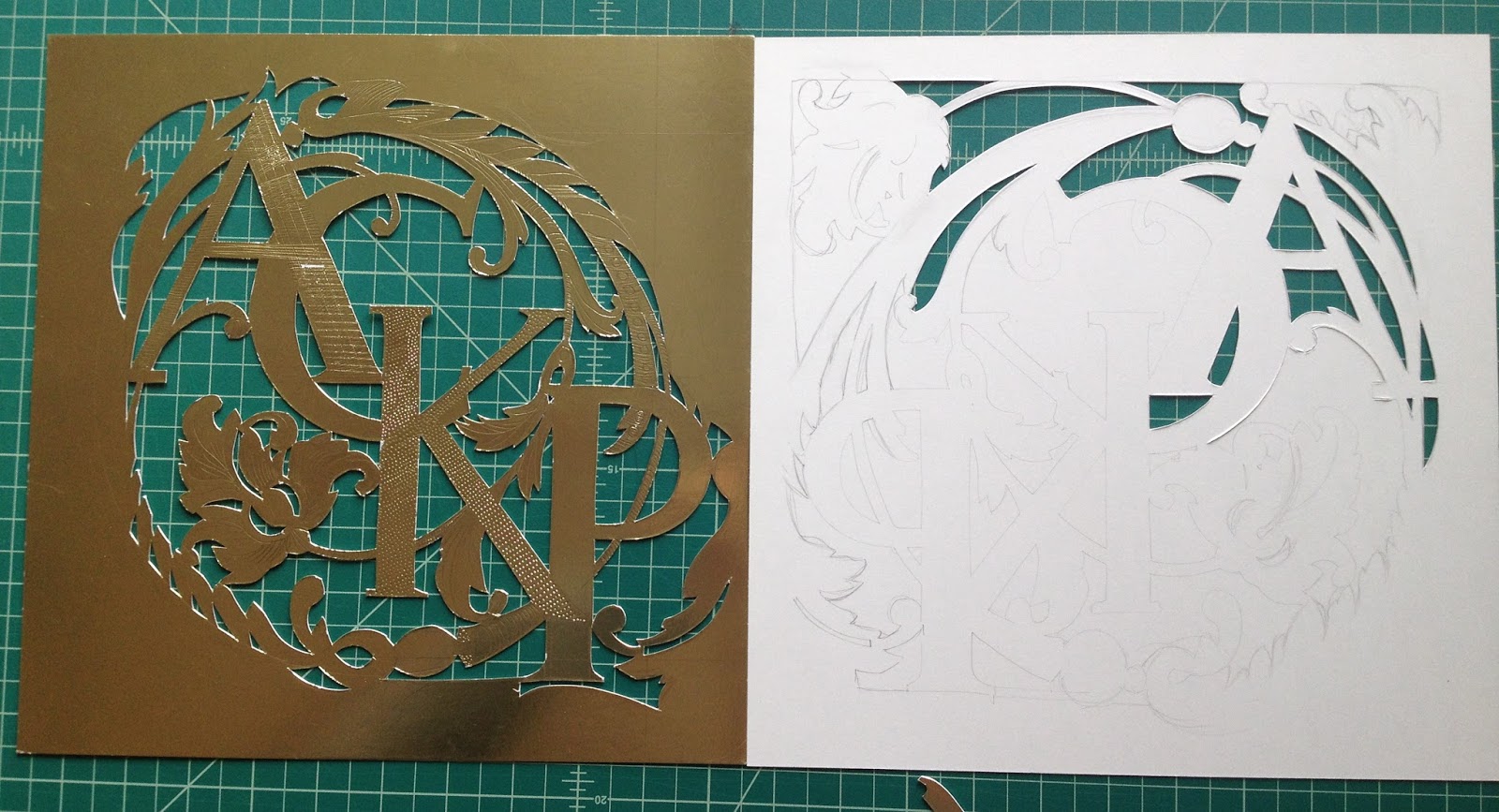
Second attempt, left, was used to transfer design to back of attempt #3. Cutting the mylar from the back gave a cleaner look.
 This wedding gift of the couple's initials took three iterations to get right. I've cut, patterned and tooled the gold mylar on card stock to distinguish letters from vine and cutout from background.

This morning, I realized (again) that only way out is through the work.

While I'd love a magic solution, working through each step of design and cutting tells me the next necessary step. It that means starting over, so be it. But now I have that knowledge from making that mistake.  
The Magic solution is work.

Here it is framed up and ready to be packed for the trip to the wedding in New Hampshire!